The problem:
The Alberta Security Commission was receiving too many enforcement communications via email and calls even though they had an online complaint form. They needed to promote the online submission process while providing a way for users to self-assess whether the ASC was the correct jurisdiction for their concerns. Being able to reduce the number of assessment communications would free up Commission resources, allowing them to focus on their Enforcement mandate.
The project:
The complaint information pages, viewed before starting the detailed form, had multiple issues that may have distracted users from using the online complaint system:
- The ASC had an ‘initial assessment’ form for users to determine if their complaint was a valid ASC issue, however these could not be linked to a ‘detailed complaint’ later on, resulting in duplication and manual processing to reconcile complaints.
- Help content linked to other areas of the site, directing users away from the complaint form
- Multiple calls to action all of equal value at the beginning of the process slowed down decision making
- The form was responsive but not mobile friendly
- Page content had a high emphasis on email/phone support options
The Solution:
Simple
After an analysis of the complaint section and submission funnel, simplifying the content and call to action was one of the simplest things to do within the CMS without development work. This included:
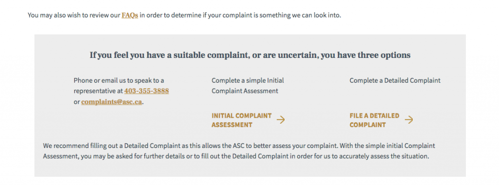
- Reducing the prominence of email and phone options – removing it as the first option
- Placing relevant content on the page (FAQs) instead of linking away
- Making ‘File a complaint’ a button and the primary CTA
- Removing the ‘Initial Complaint Assessment’ option
Removing the initial assessment solved a couple of ASC issues. It would increase the quality of complaint information received, decrease the need for resource heavy follow-up and eliminate the reconciliation of the two complaint types. It just made sense asking for greater information at the start of the process and give the commission more to work with, instead of burning through resources to discover the complaint wasn’t within ASC jurisdiction.

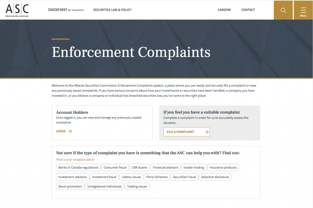
New landing features a singular call to action button, explains secondary actions and features a self assessment. Phone and email options are pushed further down the page

The old landing page layout featured FAQs that directed users to away to another page , listed phone & email options first and had several CTAs.
Helpful
To compensate for removing the Initial Assessment, a new self-serve tool was developed to help complainants determine if their concern was something the ASC could help with. The interactive tool leveraged the original content, but presented it in a manner that was easier to scan, delivering actionable answers instead of forcing the user to read, comprehend & decide.

New self-assessment tool featured alphabetical complaint types, helping users scan and find their concern easier.
Results are actionable. After a user selects a complaint type, helpful links are presented immediately allowing users to stay on task.

Old help text – you have to scan the columns to find your complaint type, which don’t appear to be in any specific order, recognize whether it is within ASC jurisdiction or not, then find the ‘file a complaint’ action located elsewhere on the page
Mobile first
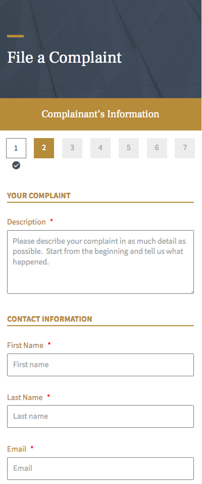
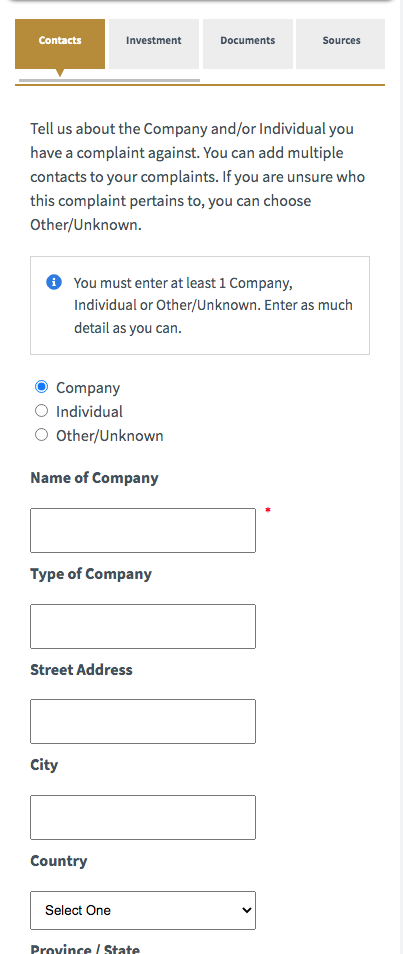
The actual complaint form was enhanced to perform well on a mobile device. The original form, while responsive, wasn’t optimized for small screens.
- Users needed to scroll sideways in order to see how many steps were required
- Users could jump from step to step, making it easy to miss entering information
- Validation only flagged one error at a time
- Labels were not visually grouped with its form field, potentially causing confusion
Reviewing the complaint workflow, information architecture and content allowed me to advise on content structure, develop helpful tools and improve the form’s stepped process for mobile. As a result, the commission achieved their goals of increased form submission and decreased call and email support.


