

The Project
The British Columbia Securities Commission (BCSC) is a regulatory agency that administers and enforces securities legislation in BC. The website provides guidance and information regarding requirements, compliance and enforcement to industry, and investor education to the public.
The new website, redesign and CMS implementation, had the very tight deadline of five months to move from requirements gathering to deployment. Over the course of two months, I evolved an IA produced by an outside consultant, and developed interactive wireframes and interaction definitions for the final build.
The Problem
The project required consultation with many stakeholders who were subject matter experts in their fields, but not necessarily knowledgeable about the web or the overall site strategy. Recommendations differing from the existing site, needed reasoning and socialization before acceptance. The challenge was to balance each groups’ wants and needs, with the BCSC’s overall legal and security requirements while fulfilling the diverse needs of the site’s users.
Developing a good design serving all these needs before the build portion of the project would have been impossible without the comprehensive usability study developed by an outside consultant. This study allowed me to quickly dive-in, understand pain points and find design solutions and strategies to satisfy all the groups.
The Solution
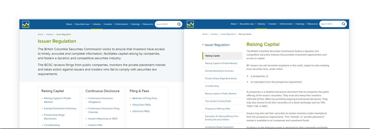
The early usability studies found that the Law and Policy section of the site served frequent and expert users well. It made sense to replicate the structure, which was developed by librarians and was respected across Canada. However, the study also found that other areas of the site were confusing for users new to the Securities landscape. The information architecture was geared towards experts and nested content deep into sections, which made it difficult for users to discover or retrace their way to specific pages.
My tasks to improve the site’s usability and make content more findable and discoverable were to:
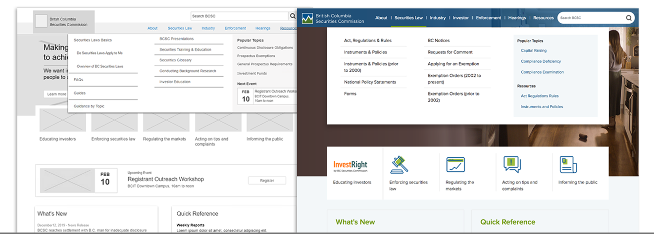
1. Devise a more intuitive IA and create more access points to deeper content
Evolving and gaining acceptance of a new IA, required workshops and consultation with all business owners to gain insight into their areas, gather their specific requirements, and to rationalize any proposed changes. Presenting wireframes demonstrating jump off points into content helped groups understand recommendations, allowing them to accept and or provide suggestions and critiques.
Creating more access points was achieved through a combination of landing pages, pathway pages and components. Both landing pages provide access to section top tasks and provide an overview of the section’s content.
One level lower than landing pages, pathway pages are more granular. They allow a user to evaluate and explore the section’s content. As such, pathway pages be an introduction or highlight valuable information
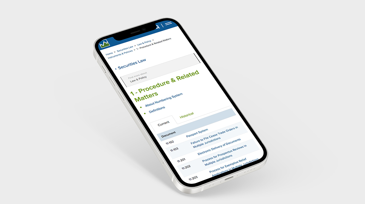
2. Developing a mobile navigation system for deep content
A flexible mobile UI was developed to leverage the IA. In addition to the primary navigation, and breadcrumbs, links to landing pages and pathway navigation was developed, to allow users to remain and explore within a section.
3. Improve the visibility of help content for those seeking to understand securities law and requirements
The Bayleaf team proposed creating an FAQ content type that allowed singular content pieces to be displayed on specific pages and simultaneously show within a consolidated FAQ compendium. This allows valuable information to be displayed both contextually within the IA and on a single resource page with topic filters.The design, an accordion, was economical in display and harnessed established FAQ design patterns.
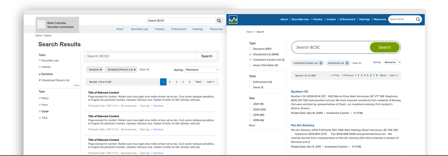
4. Improving search and filtering capabilities
One of the biggest changes for the BCSC was the implementation of faceted search. Functionally a developer task, the design needed to accommodate a complex taxonomy and satisfy user expectations.
The global search, included a design optimized for mobile use, harnesses design patterns commonly seen on ecommerce sites. The facets, developed during taxonomy workshops, allow users to select and drill down through progressively narrower choices. The interactions and search capabilities deliver an enhanced user experience, by smoothly returning high quality results, thereby increasing the site’s value and authority.
Just a bit more on wirefames
The wireframes both explained how different components could be used throughout the website, and served as a blueprint for developers to execute on. For sign-off I created page layouts with examples of controls, featuring either dynamic or manually defined content, to promote related or deeper related topics. For example, a landing page might feature widgets that dynamically display the most recently added news releases or companies added to the Investment Caution list. Curated content could be featured in manually configured controls to promote timely reports or training materials. The mega menu could also be utilized to display contextually relevant material to users as they explore the site.
The wireframes were key to educating business owners, and exciting them with new ideas and approaches. They were pivotal in gaining buy-in to the process and a radically different site. The reusable components gave BCSC the power and flexibility to build out pages aligned with their evolving web strategy. Each component design included business requirements, defined during workshops, and developer specifications consolidating and streamlining documentation.
The project finished on time and on budget without any project delays. The new design launched at the end of July 2020 and Bayleaf continues to work with the BCSC on site.