
PUMA redesign and redevelopment
Project objective:
To modernise the application’s look and feel, improve the PUMA user experience for clients and create a new GHG planning interface.
Summary: PUMA is Prism Utility Monitoring and Analysis Software as a service.
It is a web-based utility monitoring application that reports on current consumption and costs and projects savings based on conservation actions. The application’s big value lies in its ability to provide utility accounting, which creates insight into cumulative savings, by providing analysis and measurement to climate action progress.
The redesign process was segmented into three phases where I was active in a planning & design capacity.
- Phase 1: Discovery, analysis & road mapping
- Phase 2: Consultation & design
- Phase 3: Implementation and testing
Phase 1: Discovery, analysis and road mapping.
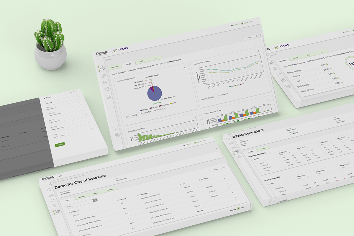
This involved understanding the product, reviewing the client’s wishlist for enhancements and developing a long term strategy for implementation. PUMA’s goals required a mix of backend updates, building new functionality and a full-fledged redesign system. Motivation for such a large scale update was to remain competitive and to offer more services. The visual redesign was core, as stakeholders noted, “What the software looks like has a bearing on how it is perceived”.
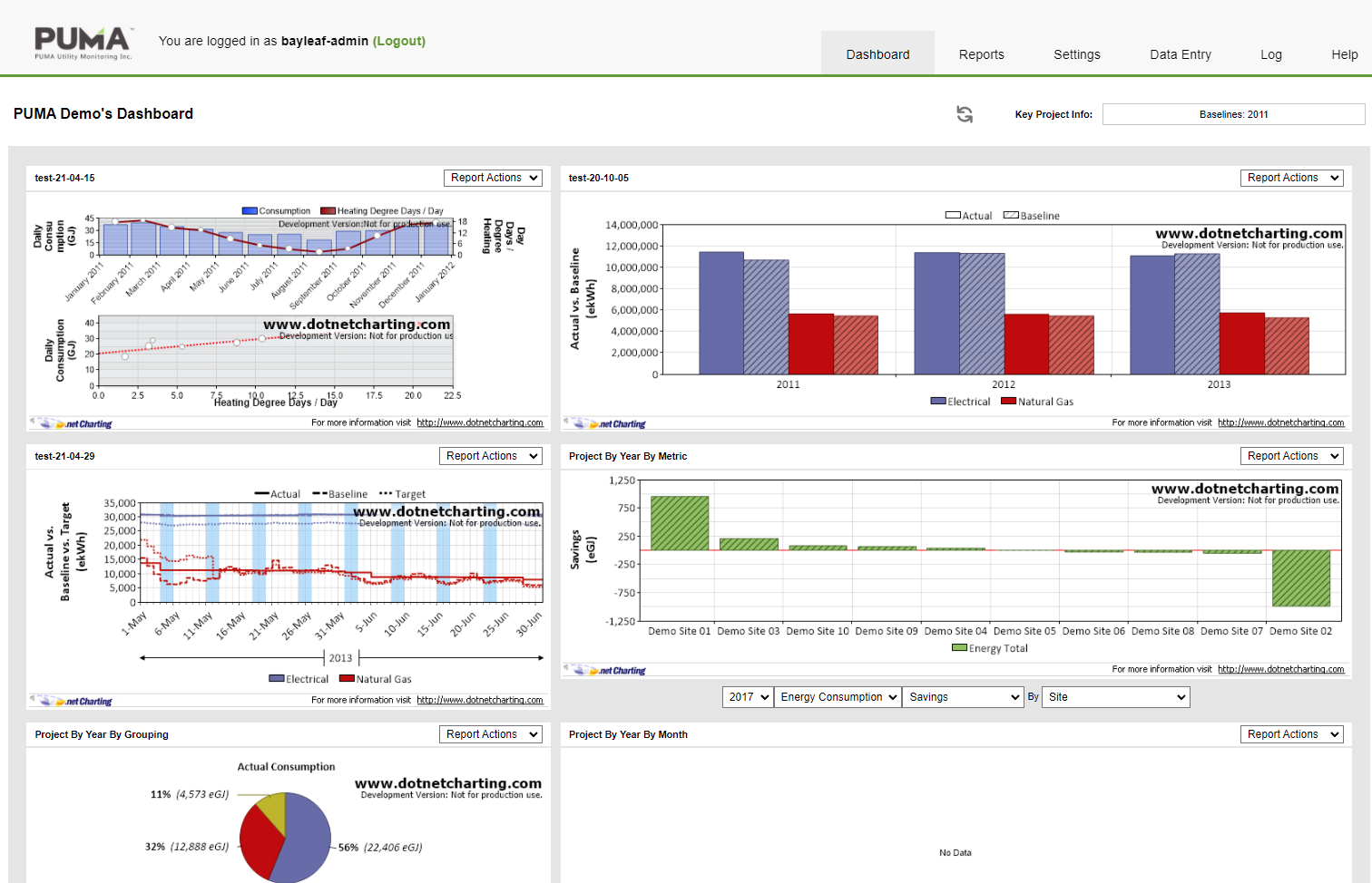
Original application dashboard design
Determining what feature to include in releases and setting expectations were key in developing a workable schedule.
Phase 2: Consultation & design
Key redesign goals were to create greater transparency, implement simpler workflows and to empower users by giving them control over their accounts. The proposed changes aligned with modern application design but were a challenge for the core PUMA team to conceptualise having worked with the old framework for many years.
One of the key tools in gaining acceptance and approval was the Adobe XD file I created to walk stakeholders through the proposed IA and redesign. The file allowed PUMA to click through workflows and provided a platform to ask questions and suggest revisions. The design evolved over a 2 month span, beginning with initial concepts, then client feedback integration with additional enhancements during the development cycles as issues or requests came up.
Phase 3: Implementation and testing
With all the requirements captured and design approved, I began working with the development team to make PUMA 2.0 a reality. As is often the case, even the most careful planning can’t anticipate everything. Some unexpected issues and unforeseen scenarios materialised in testing, requiring additional UI work. Working closely with developers I could easily advise on components, interactions and text feedback to create a consistent and clear user experience.
This was particularly true with the new Greenhouse Gas Planning functionality build. While doing QA during development, I could already identify future enhancements to improve usability. Making judgement calls to prioritise or backlog items was important to keep the project focused and delivered on-time. We used jira to document and to track issues, time and decision points for full transparency.
Key UX enhancements:
- Restructure site architecture – making it more user-centric, simplifying user access to reports and data
- Improved access to reports – the application’s core functionality
- originally set up as a nested interface, requiring users to progressively select options before accessing the desired report. The hidden nature of nested reports also prevented users from browsing and scanning their options, a user would have to ‘know’ what reporting category to search under
- The new system has a typeahead autosuggest search, where the suggested results are hyperlinked to the desired report. Duncan W. (Client Services Leader, former PUMA Team Leader): “Typing a custom report name into the search box and having it come up, was a moment of delight”
- The ‘like’ function allows users to save their favourite and frequently used reports to a highly visible and accessible location on the page. Leveraging a familiar pattern used in applications and social media, (tapping on a heart) users can easily understand usage, increasing the functionality’s uptake
- Organising the report options into accordions grouped by category allows users to explore and understand the breadth of utility monitoring and analysis available in the application
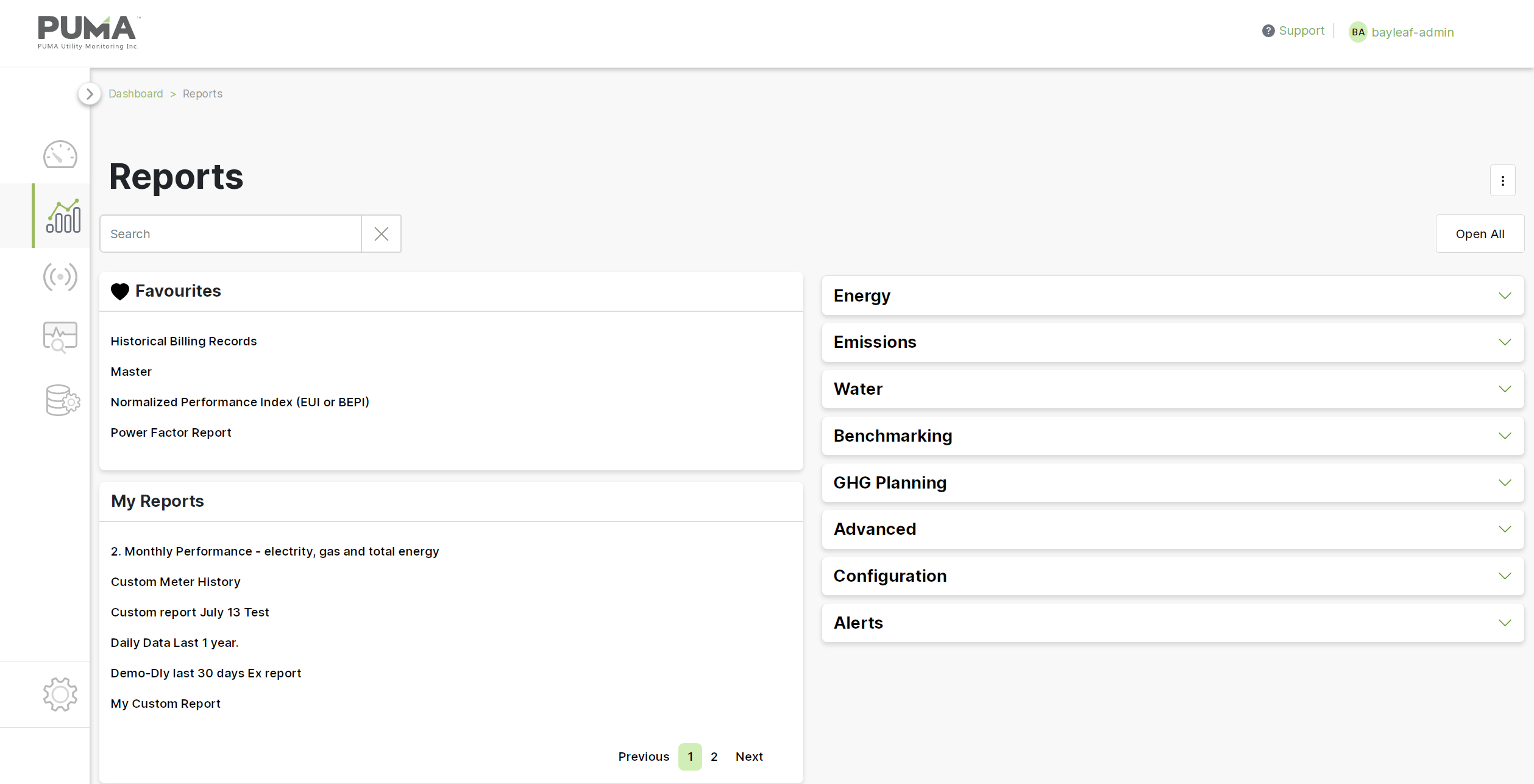
New design features search, accordion and favourites functionality, allowing users to find and save reports with ease
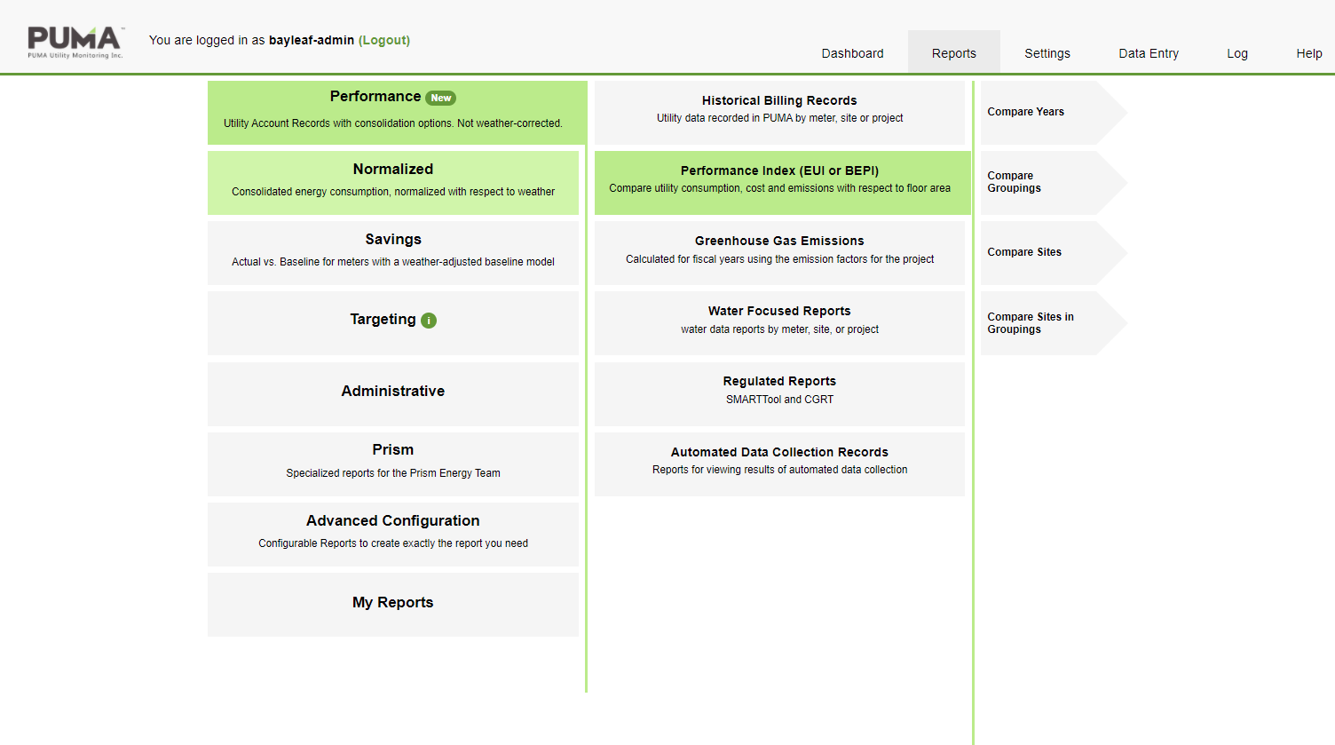
Previous version required users to progressively drill down for reports, requiring the user to already know how the report they wanted was catagorized
The Beta version was launched for select clients at the end of 2021. Initial feedback from clients:
- VCC: It looks amazing and user friendly! thank you for working so hard for us we needed all these upgrades
- Telus: looks nice and sleek. like the ghg planning features. thanks!
- YVR: Looks awesome and I especially love the planning/targetting functions. Icing on the cake for 2.0 or 3.0 would be to be able to customize colours for the charts (would be great for us to have our brand colours).