The Project
The TCS (Transfer Credit System), is a workflow application for establishing credit transfer agreements between post-secondary institutions. The agreements increase student mobility by allowing students to study at one institution and get credits for their work at another. The agreements are also fed into the BC Transfer Guide which allow the public to look up articulation agreements.
The Problem
Over the years, the application evolved at the hands of many developers, and lacked a defined style guide for components and pages. As a result, the application functioned, but was confusing because of poorly laid out information and inconsistently styled components.
The Solution
The first order of business was to understand & survey the application to see where consistency could be implemented and styles consolidated. An example of this, is how page titles displayed, depending on the location within the application. Previously:
Once a survey was complete, small steps were taken to create consistency and harmony.
Example:
- adding breadcrumbs as a way-finding mechanism within the application
- constantly applying page titles
- creating a visual hierarchy of information (Course name, course title, location)
Another simple fix in presenting detailed information was creating consistently applied table styles to unify page layouts.
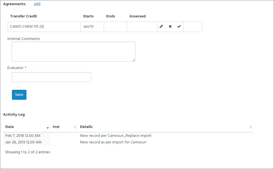
Previously:
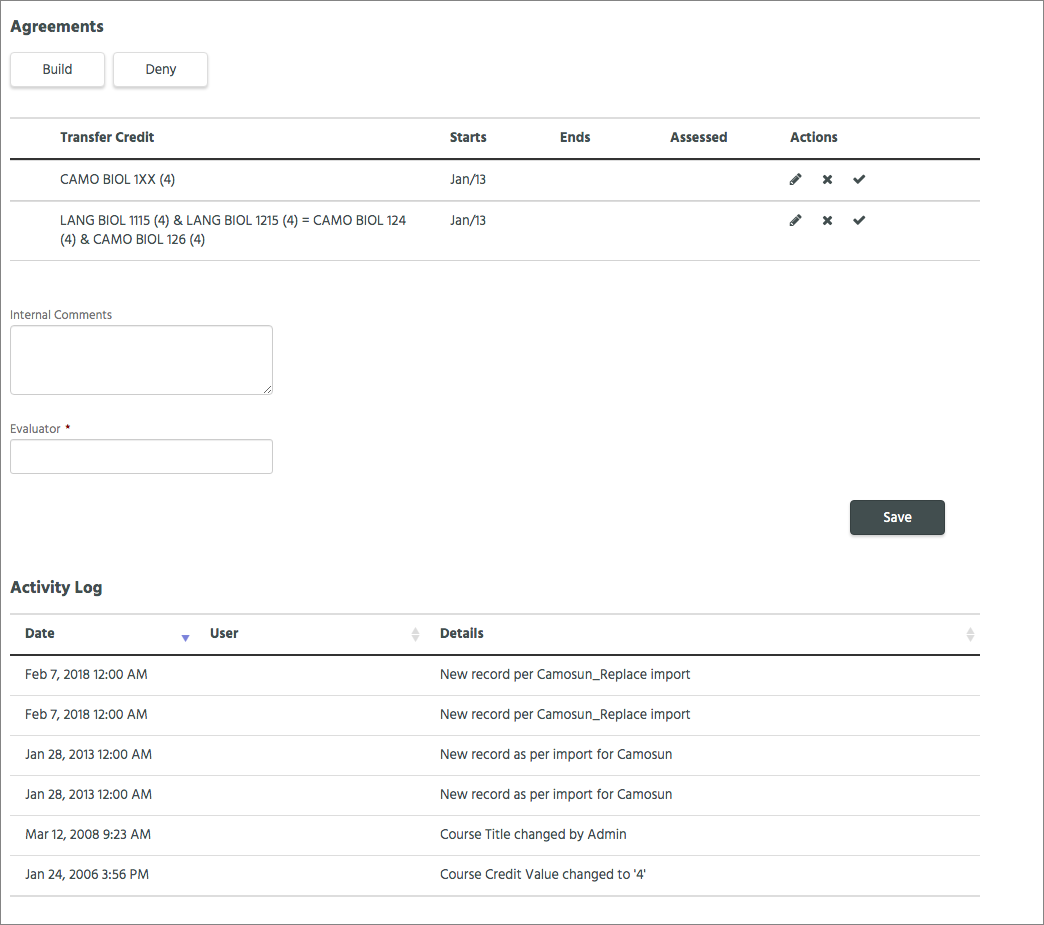
New display:

Consistently applied table styles unify and simplify information presented. Standardized buttons with set minimum width and alignment on form labels create visual consistency.
The other task required was evaluating the information displayed and removing redundancy. This helped allow the important data to shine.
Previously:

Radio buttons imply action, document title is irrelevant and course title is redundant as it already displays on the page
New display:
Creating a style guide to define colors, styles, typography and reusable components allowed developers to pull from a single source and apply styles consistently across the application. The results are a more understandable interface, allowing more post secondary users to participate in the articulation process, rather than a handful of specialized users.


