Website Redesign
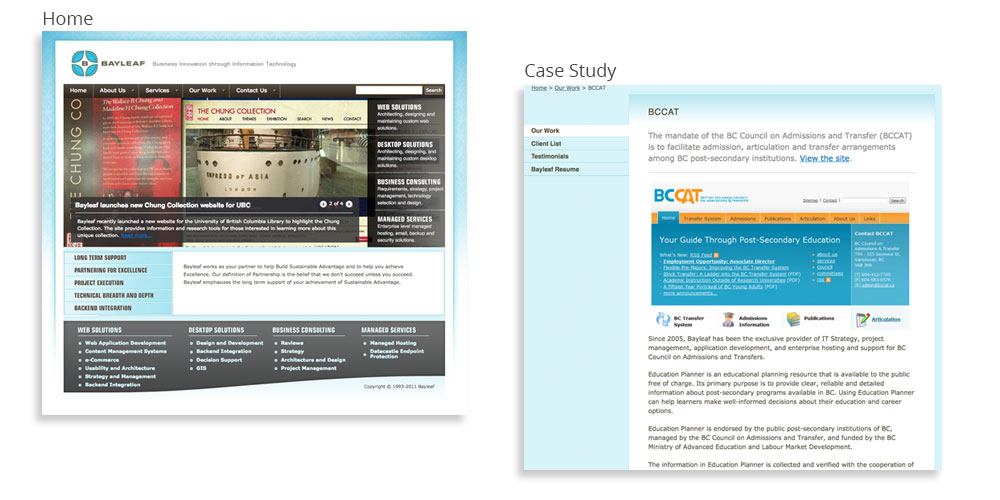
When I joined the company, I was tasked with redesigning the website and providing graphic treatments for interior walls. The existing website, conformed to ‘above the fold’ standards, and was not mobile nor reader friendly.
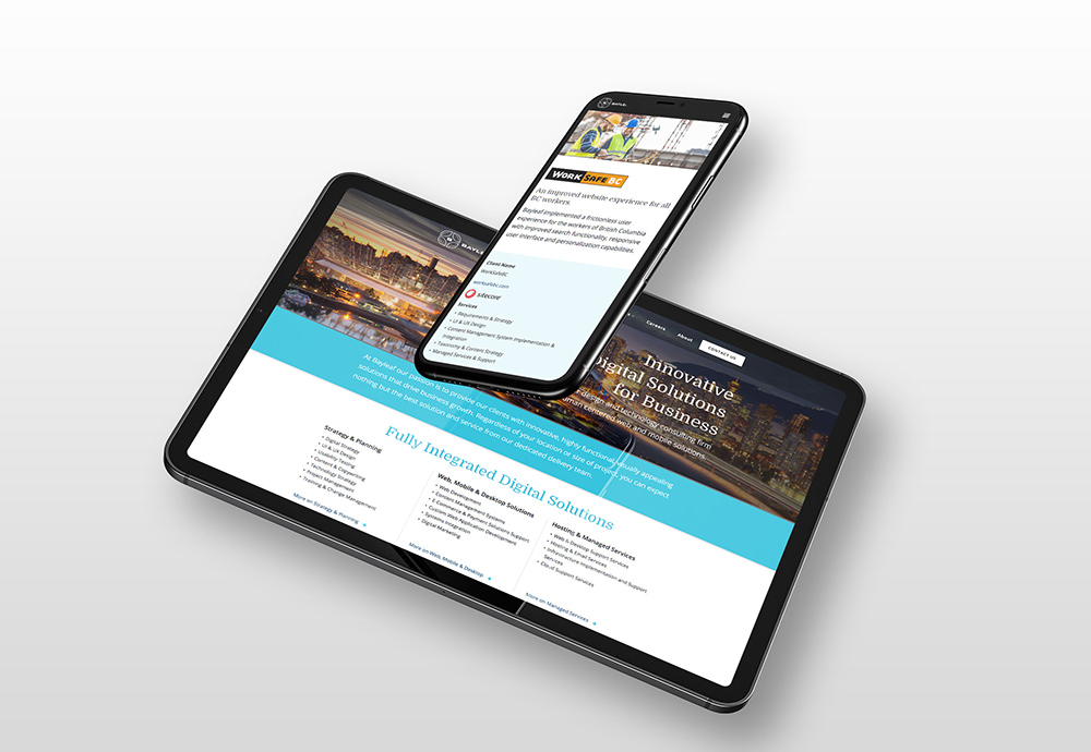
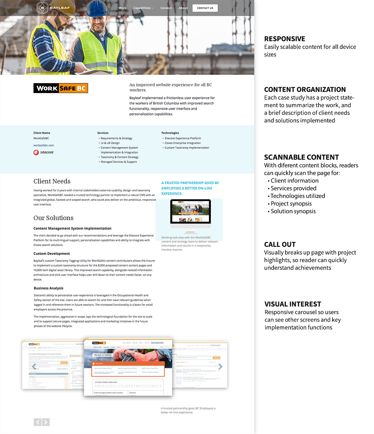
The new, responsive design focuses on case studies to display the company’s abilities and expertise. (Bayleaf.com)The pages are easy to scan and highlight the company’s value by clearly providing:
- A project statement
- A statement of client needs
- A description of Bayleaf’s solutions
- Bullet list of technologies used
Custom images and graphic text callouts bring attention to solutions, while breaking out the content into digestible chunks.
The copy was written with respect to the technical aspects of the project, while conveying a friendly, bright tone aligned with the company’s brand personality.
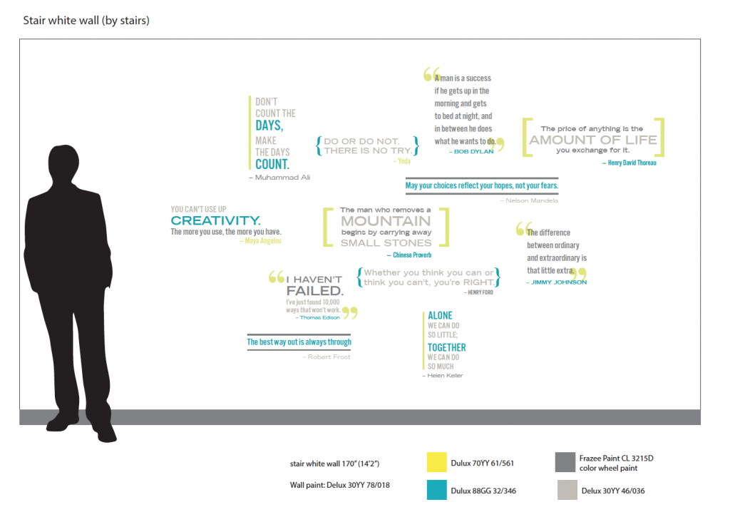
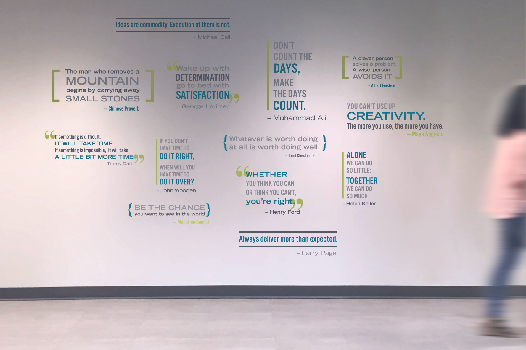
Office Interior Graphics
Having recently relocated, the new office featured designer interiors, but lacked character. The owners wanted to give the space personality, but were unsure how to accomplish it.
Through a design and discovery process where ideas were quickly and sometime humorously generated and comped out, the owners were able to confidently identify a design direction, which was then developed into final graphic treatments.
