VARIOUS CLIENTS
brochures, folders, pamphlets, stationery, environment design
In collaboration with Max Advertising’s creative team, I was the lead on Salt and responsible for directing the team as well as managing all the interactive components. Strategic marketing and design included developing an identity, creating a logo, designing a sales centre, website and brochure, as well as creating multimedia video presentations, interactive screens and virtual tours. The final logo was created by Eyan Myers who also lent a hand in the sales centre.
Sales Centre
Working closely with an interior designer, a small, grungy retail space was transformed into a sleek, sophisticated, ultra modern presentation centre. Along with printed information panels, the space features four interactive touch screens, a four-screen TV system with video loops and a seamless backlit view. A close-cropped high-gloss pixel pattern on the interactive wall linked the space with the marketing campaign as well as provides an interesting texture.
Brochure
The cover features a matte varnish on the girl, a high gloss spot varnishes on the pixel elements and an overall reticulated varnish that creates a salt like texture. The interior pages continue the reticulated and high gloss spot varnishes.
Multimedia
I created the storyboard for this video to introduce potential buyers to Salt’s emerging neighbourhood. Aimed at off shore purchasers, the opening positions the building within a world class city – a stone’s throw from some of Vancouver’s most exciting areas. Parts of this video were incorporated into a looping four screen video presentation, which I also storyboarded and managed the production of.
Chelsea
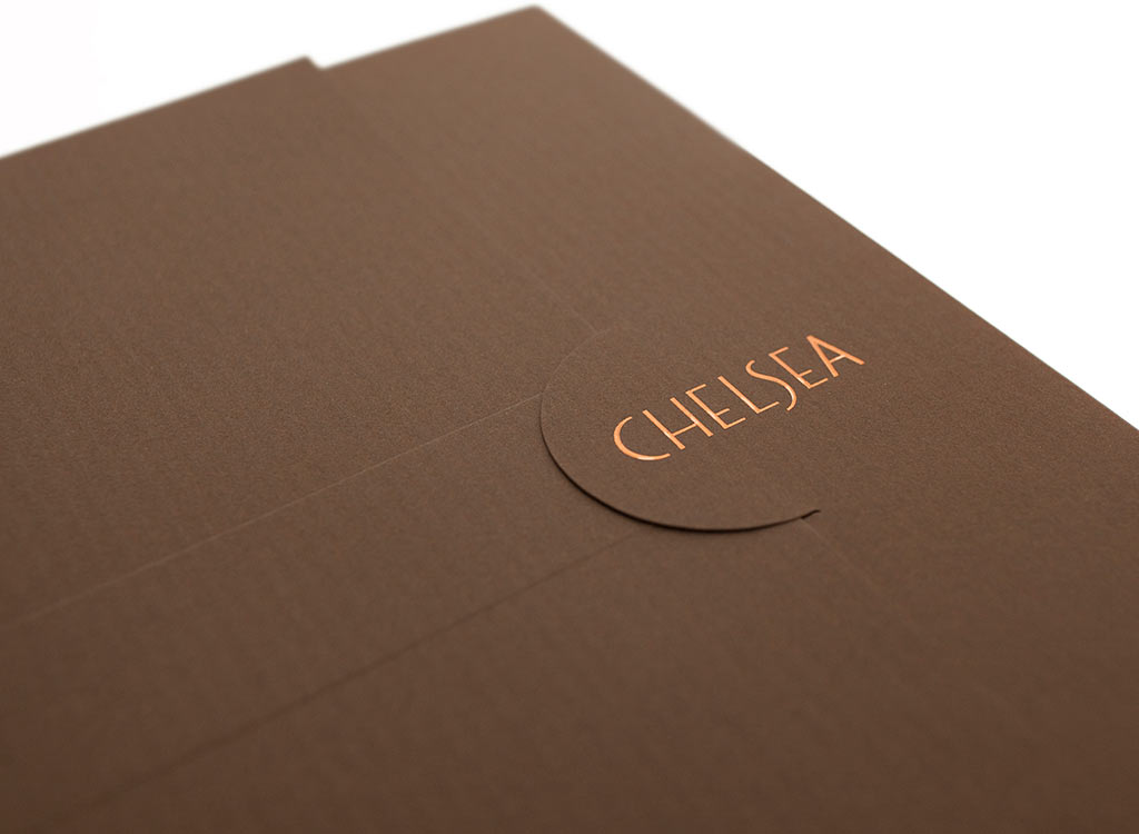
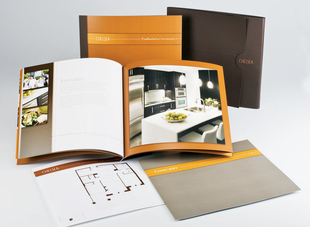
Produced while at Max Advertising. This project was marketed towards those retiring in Victoria. The brochure aimed to be quietly rich with large feature images, quality paper and matchbook binding. The folder was produced on Classic Columns, with a matte copper foil on the logo.
Palladio
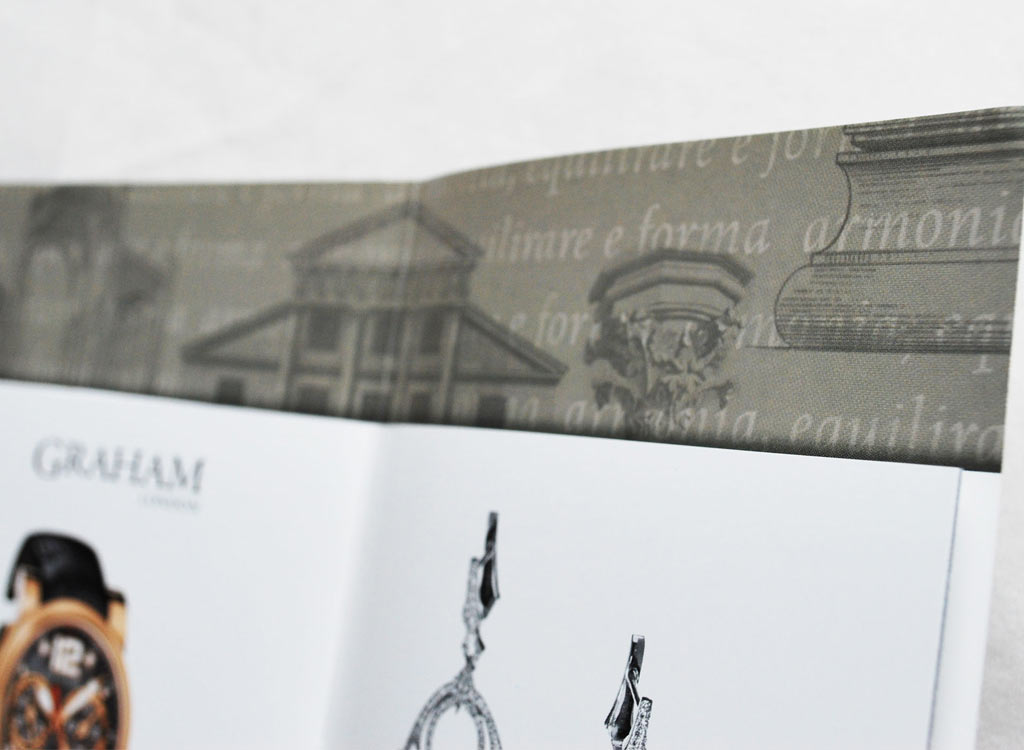
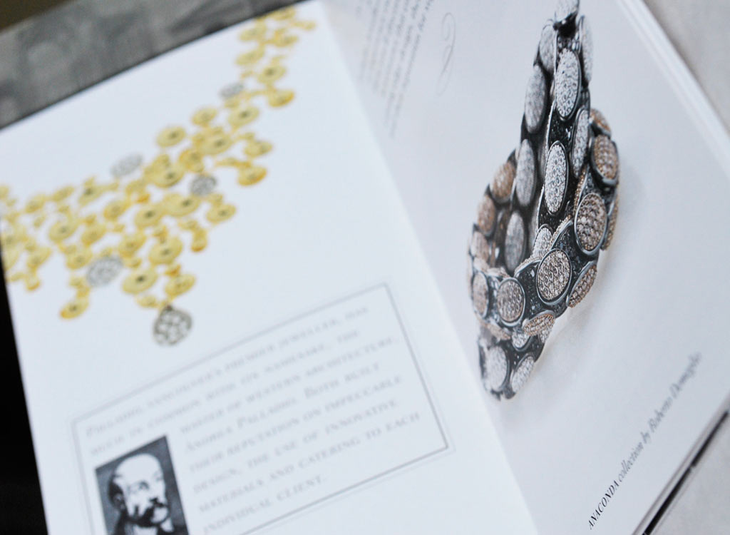
Acting as the Art Director, this commemorative anniversary brochure was created for a prestigious jeweler and produced by Max Advertising. The piece explained the origins of the store’s name – Andrea Palladio, an Italian Renaissance Architect, and featured the store’s distinctive offerings. A unique border of classical Italian architectural motifs, blended with text was specially created for this brochure.
Little People’s Preschool
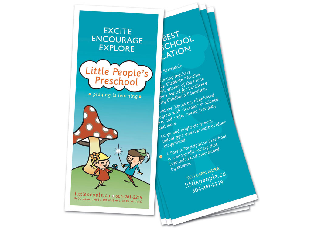
Little People’s Preschool is a play based preschool based in the Kerrisdale area of Vancouver. The original identity featured gnomes and toadstools which were retained in the new identity. Posters, a-boards, signage and postcards were created to great success as the school enjoyed an increased in enrollment and higher profile in the community.
